ZONEEE
Zoneee is a clinic management software B2B Saas (UK)
The project focused on Brand Strategy, Creative Direction, Market Positioning and Art Direction. #3 on Google UK for Chiropractic Software (Strong Brand Recall).
The Challenge:
The market has been highly dominated by another player - PracticeHub. The audience are healthcare practioners who don’t share the values of business growth (but as we knew later need it the most).
This is where our work sat. By focusing on what the millenial audience wanted the most and extracting deep audience insights we build the brand around the common purpose - to allow them to do what they love while staying ‘in the zone’ and running a thriving business. We connected (WHY) with Zoneee’s audience by accentuating their need to help people, and changing the beleif around having a thriving business while doing so. Then we explained how that can be done with smart systems (HOW), and finally gave them the software solution (WHAT).
Brand Naming, Brand Strategy, Art Direction
Logo + Brand name
Zoneee name came from the concept of “being in your element” or staying in the zone which falls under the core desires of practitioners to stay in their element while treating patients and not be distracted.
A series of interviews were conducted with founders, market research and competitor branding analysis, brainstorming sessions on the visual identity of the brand in the time frame of 8 weeks were necessary for completion of strategy + Logo + Name. The logo symbolises how different dots come together and one is leading the pack.
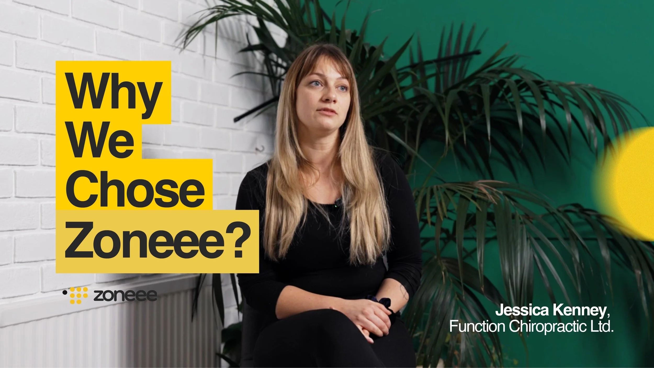
Brand Community
The brand mission consisted of the brand mission statement, which served as the company’s purpose for existence and the difference it makes in the world, the core values, tone of voice, and the visual identity. We made an effort to create a community around the brand to establish trust and authority.
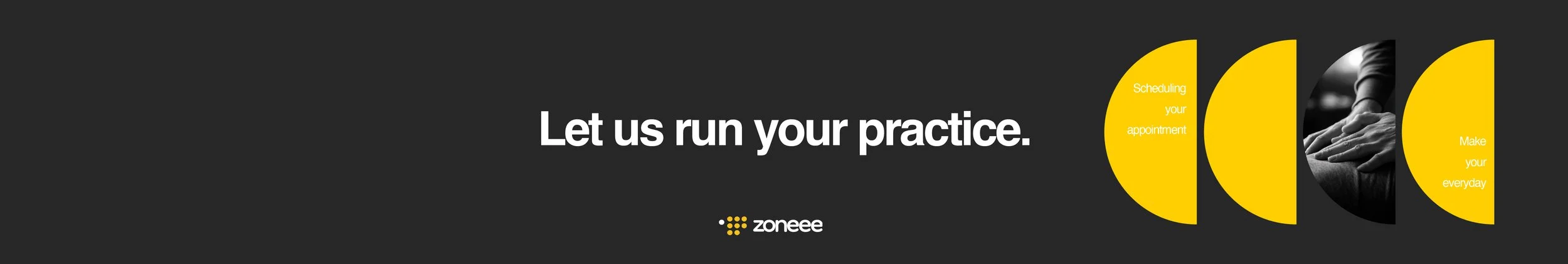
Visual identity
The color palette is intentionally chosen to represent the old school rules of running a business. With black representing quite authority, yellow positivity (chosen color among millenials), and white for starting fresh.
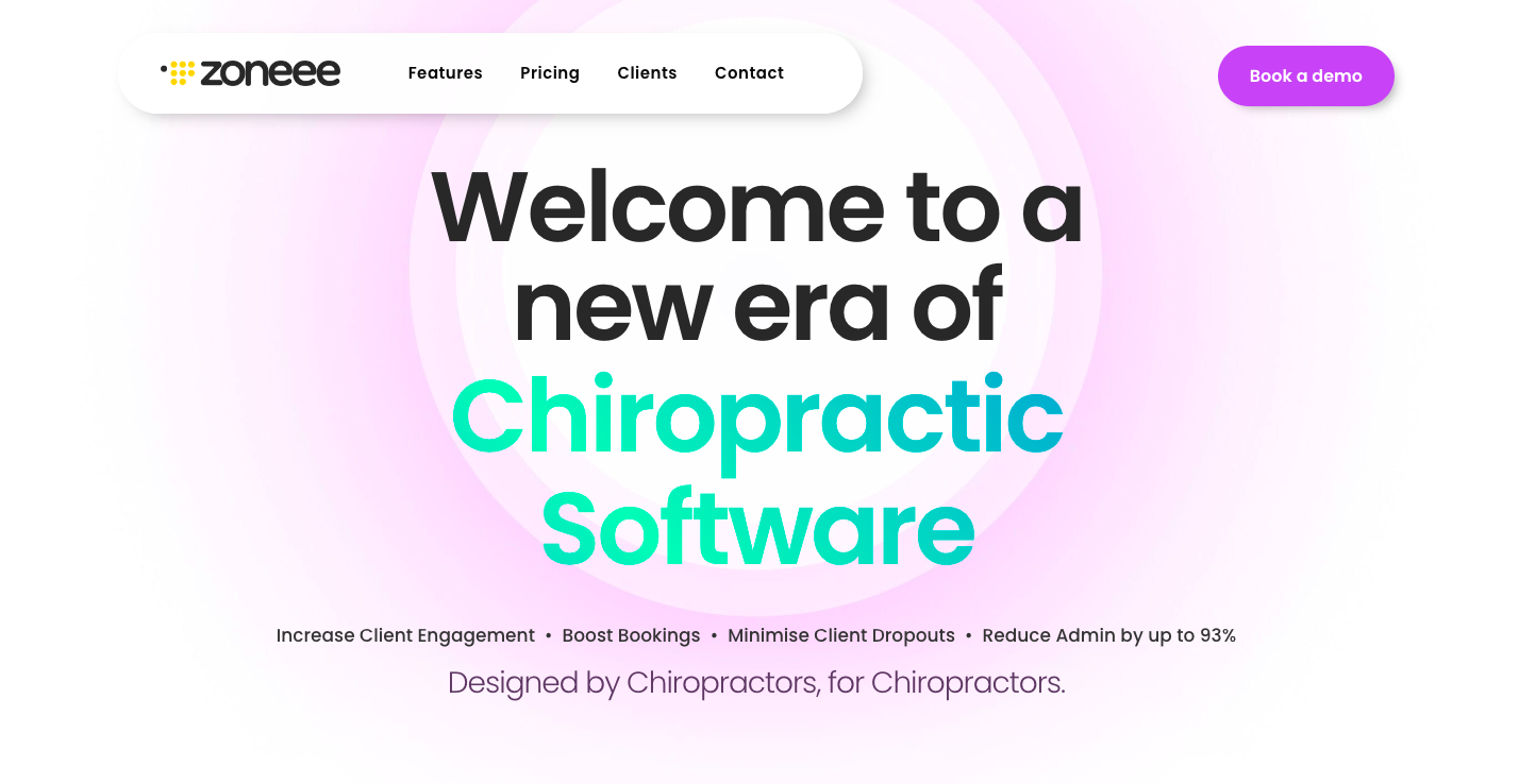
Website + Social Media Channels